The Number Of Reviews Versus The Occupancy Rate Of Airbnb Rooms
In this site there are three interactive charts that depict the effect of the number of reviews given by the Airbnb customers.
This wind rose chart illustrates the number of occupied rooms based on the occupancy rate percentage for all regions. By interacting with each regions individually, you will notice a stark difference in the number of reviews between rooms with high occupancy rate (70% to 100%) and low occupancy rate (0% to 70%) depending on the regions. Click around to see what happen!
No zero or negative percentage difference = The mean number of reviews for rooms with high occupancy rate is lower than the other rooms!
This indicates that there is a higher chance for a room to have high occupancy rate when it has a higher number of reviews than the average value as customers prefer rooms that have a higher number of reviews
Limitations: It does not factor in the level of positivity or negativity of the reviews, which may affect the customers' preference from an emotional prespective. It also does not include the overall rankings of the rooms given in the reviews due to the lack of information in the given datasets

The changes of the number of reviews for each regions can also be presented in this histogram plot shown above
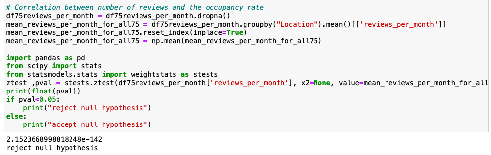
Since p-value is less than 0.01, there is a strong correlation between the number of reviews and the high occupancy rate of Airbnb. There is a huge difference between the number of reviews of rooms with high occupancy rate(75% and above) and those below